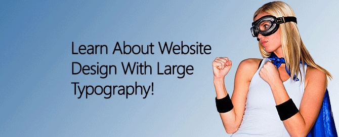
Typography is more than something that is used in web design. It is an art element, all on its own. There is a lot to like about the use of large type as part of a good web design. However, for it to be done effectively, without being too tacky, a designer must understand exactly how to use large type most attractively and efficiently. When used properly, large typography and decorative fonts can be an important element in the best web design!
Why Design With Large Type?
The trick to using large typography in a more pronounced and decorative sense, is realizing it is a design element – not just words on the screen. Words meant to be read for content should always be presented in an easy to read font that is not overwhelming, or overly distracting. Type used as a design element – even though it spells out words – is used for emphasis, more than anything else. It has also become somewhat of a trend in certain types of web design since enlarged, decorative type works so well for many different things, such as the following:
- Attracts Attention – Bigger, bolder type can be used as a logo, page header, or some other main focal point to draw attention to a website in the same way an image might. The more a decorative, large typeface stands out from the rest of the content, the more attention it will attract.
- Evokes Emotion – Typeface can be emotional. Some are prim and proper, while others are fun and flirtatious. Emotion is an important part of the best web design. Using large type to create a desired emotion is a wonderful way for designers to get a brand’s message across. Create the right mood with the right decorative, oversized typeface, and users will have a better, more effective understanding of the rest of the page.
- Establishes Importance – In print and web design, larger means more important, while smaller means more details. When larger type is used in the right styles and colors, it is great for getting across summary ideas and other ideas of importance. For this very reason, large type is great for page and content headers, as well as calls to action. Setting certain content apart from the main body by using different sizes, boldness, color and typeface, makes it easy to portray something that should be regarded with importance.
Using Large Type Correctly
For the best effects, such as those mentioned above, web design must incorporate large type in the right ways. This type style is extremely important, and should look different from the rest of the body content, but compliment it at the same time. Be sure to use fonts that portray the same messages. Use colors that blend well with the main color scheme. Colors that stand out are great, but they must still compliment the primary color. Always stick with the basic rules of font use, and do not use too many in a single design. Plan a design based on emphasis and mood. Above all, make sure the typefaces chosen are easy to read, or any important effect will be lost. Getting the perfect combination of typefaces, font weight and color can be tricky, but achieving this goal produces an attractive, effective web design that works!
With the skillful use of large type as a design element, web design can be both trendy and stylish, while being attention grabbing, and portraying importance all at the same time. The best web design will use large typography as much more than just words on a page, but as a means of portraying mood, direction and relevance. This effect works well since it is attractive, while aiding user function – a win-win situation for any website!
Want A Great Web Design Firm In College Station?
Web Unlimited Can Help Build Your Website!
You Can Call Us At (979) 599-7530!
Additional Articles:
Does Your Web Design Help or Hinder Voice Search?
Deciphering Web Page Error Codes – What Do They Mean?
What Types Of Web Design Are Disappearing In 2015?